About Shared Components
The Shared Components section of the Page Definition contains common elements that can display or be applied on any page within an application.

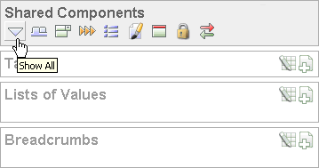
Description of the illustration shared_components.gif
You can quickly navigate to a specific subsection by clicking the icons beneath the heading. When you select one of these icons, the subsection appears and all other subsections are temporarily hidden. To restore the view, click Show All. The Show All icon resembles an inverted triangle.
Topics:
Tabs
Tabs are an effective way to navigate between pages of an application. Application Builder includes two types of tabs: standard tabs and parent tabs.
An application having only one level of tabs uses a standard tab set. A standard tab set is associated with a specific page. You can use standard tabs to link users to other pages within your application. A parent tab set functions as a container to hold a group of standard tabs. Parent tabs give users another level of navigation as well as context (or sense of place) within the application.
Lists of Values
A list of values (LOV) is a static or dynamic definition used to display a specific type of page item, such as a radio group, check box, or select list. LOVs can be static (that is, based on a set of predefined display and return values) or dynamic (based on SQL queries that select values from tables). Once created, an LOV can then be referenced by one or more page items.
You define LOVs at the application level by running the LOV Wizard and adding them to the List of Values repository.
Breadcrumbs
A breadcrumb is a hierarchical list of links that is rendered using a template. For example, you can display breadcrumbs as a list of links or as a breadcrumb path.
Lists
A list is a collection of links that is rendered using a template. For each list entry, you specify display text, a target URL, and other attributes that control when and how the list entry displays. You control the display of the list and the appearance of all list entries by linking the list to a template.
Theme
A theme is a named collection of templates that defines the application user interface. Each theme contains templates for every type of application component and page control, including individual pages, regions, reports, lists, labels, menus, buttons, and list of values.
Templates
Templates control the look and feel of the pages in your application. As you create your application, you specify templates for pages, regions, reports, lists, labels, menus, buttons, and popup lists of values. Groups of templates are organized into named collections called themes.
Security
You can provide security for your application by specifying an authorization scheme. Authorization is a broad term for controlling access to resources based on user privileges.
Navigation Bar
Use a navigation bar to link users to various pages within an application. Typically a navigation bar is used to enable users to log in, log out, or link to Help text. The location of a navigation bar depends upon the associated page template. A navigation bar icon enables you to display a link from an image or text. When you create a navigation bar icon you can specify an image name, text, display sequence, and target location (a URL or page).

